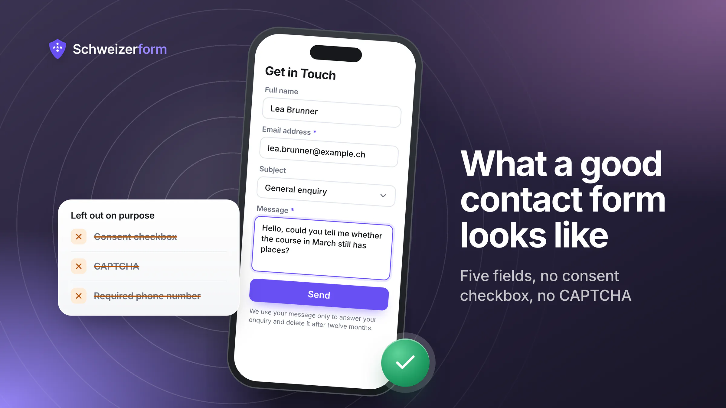
The contact form is the smallest form most organisations run, the one that gets the least attention, and the one that quietly loses the most business. It is also the form where the standard advice is worst: nearly every piece of it — the consent checkbox, the CAPTCHA, the company-name field, the phone number marked required — was added deliberately, by someone reasonable, for a reason that does not survive examination.
The short version
Five fields is usually right: name, e-mail, a subject or topic, the message, and one field specific to your business. Skip the consent checkbox — for an enquiry someone chose to send you, consent is the wrong legal basis and the box adds friction without adding protection. Do add one sentence naming who receives the message, what happens to it and how long you keep it, which is what Art. 19 nFADP actually asks for and what most Swiss contact forms are missing. Skip the CAPTCHA — a honeypot and rate limiting stop the same bots without blocking a person using a screen reader. And answer within two working days, because the fastest way to waste a good form is to leave the message sitting in a shared mailbox.
The Field List
Every field you add costs you completions and gains you information you probably will not use. The test for each one: does this change what I do next? If the answer would not alter your reply, it belongs in the conversation rather than in the form.
| Field | Verdict | Why |
|---|---|---|
| Name | Yes — one field, not two | Splitting first and last name doubles the fields and breaks for people whose name does not fit that shape. One «Name» field is enough to write a polite reply |
| Yes, required | The only field you genuinely cannot answer without | |
| Message | Yes, and make it large | A small textarea signals «be brief» and produces enquiries too vague to answer. Give it room |
| Subject or topic | Usually yes — as a short select | Routes the message and sets expectations. Four or five options, plus «something else» |
| Phone number | Optional at most | Required phone is one of the biggest single drop-off causes. Many people will not give a number to strangers, and you asked for their e-mail already |
| Company | Only if you are strictly B2B | On a general contact form it excludes private individuals and tells you nothing you cannot see in the signature |
| Salutation / title | No | Forces people into categories that may not fit, for no operational gain |
| Date of birth, address, ID number | Never on a contact form | If you need these, you need a different form with a purpose, a retention rule and access control |
| «How did you hear about us?» | No | Your marketing question, asked at the moment the person wants something from you. Ask it after you have helped them |
The «required» discipline
A field marked required is a wall; a field marked optional is an invitation. Most forms have it backwards — everything required, so someone with a simple question has to invent a company name to get past it. Make exactly two things required: the e-mail address and the message. Everything else is optional, and you will be surprised how often people fill in optional fields when they are not being forced to.
The Privacy Question, Answered Properly
This is where Swiss and German-language contact forms go wrong most consistently, and the mistake is well-intentioned: a consent checkbox reading «I agree to the processing of my data», usually required, sometimes pre-ticked.
Two things are wrong with it. A pre-ticked box is not valid consent — consent has to be an active choice, and a box that is already ticked is not one. And more fundamentally, consent is the wrong basis for a contact form. Someone who writes to you asking a question wants an answer; processing their message in order to give them one is not something you need to extract permission for. Making people consent to being replied to is theatre that costs conversions and adds no protection.
What the law actually wants is transparency. Art. 19 nFADP asks you to inform people about the controller, the purpose, and — where relevant — the recipients and the countries involved. On a contact form that is one sentence under the button:
«We use your message and contact details only to answer your enquiry. It is stored on our servers in Switzerland, is not passed to third parties for advertising, and is deleted after twelve months. More in our privacy policy.»
Adapt the specifics, keep the shape: purpose, where it goes, who else sees it, how long you keep it, and a link. Two situations do need an actual checkbox, and only these two: subscribing to a newsletter (a separate purpose, so a separate, unticked, optional box) and transmitting special-category data such as health details — but if you are collecting health details on a contact form, the checkbox is not your problem. See collecting health data in forms.
Spam Without a CAPTCHA
A visual CAPTCHA on a contact form fails twice: it excludes people who cannot solve it — which for a public body is an accessibility problem, not a preference — and modern bots solve it more reliably than your visitors do. The measures that work are invisible:
- A honeypot field hidden from people and irresistible to naive bots. Costs nothing, catches a surprising share of automated traffic.
- A minimum time on page. A form submitted 800 milliseconds after loading was not filled in by a person.
- Rate limiting per network, so one source cannot send you a hundred messages a minute.
- No `mailto:` address in the page source, which is how most address harvesting still happens.
The full comparison of anti-abuse mechanisms — and the trade-off each makes against anonymity — is in preventing spam, bots and duplicate submissions.
The Details That Decide Whether It Works
- Real labels above the fields, not placeholder text. Placeholders vanish the moment someone starts typing, which is exactly when they need to know what the field was.
- Errors in words, next to the field, saying what to fix. A red border alone tells a person something is wrong and nothing about what.
- Never clear the form on an error. Retyping a long message because of a mistyped e-mail address is the point at which people give up and go elsewhere.
- Keyboard-navigable, with a visible focus ring. For public bodies and licensed companies this follows the accessibility standard eCH-0059, whose current version is based on WCAG 2.1 level AA; for everyone else it is simply how you avoid losing people.
- Mobile-first sizing. Most contact forms are completed on a phone. Test yours there before you test it anywhere else.
- A real confirmation, not a page that flickers. Say what happens next and when — «we usually reply within two working days» sets an expectation and buys you patience.
What Happens After Submit Is Half the Form
Three operational habits ruin otherwise good contact forms, and all three are invisible from the outside:
- The shared mailbox nobody owns. If «info@» belongs to everybody, it belongs to nobody. Name a person and a substitute, and put an actual deadline on first response.
- No retention rule. Contact enquiries accumulate for years in a mailbox with no purpose and no deletion date. Pick a period — six or twelve months is usually defensible — and make it run. See form data retention.
- The message travelling by e-mail into six inboxes. Even for ordinary enquiries this creates permanent unencrypted copies across several devices and backups. Notify that something arrived; read it in the tool.
The thing people actually send
Whatever your contact form is designed for, someone will use it to describe a medical condition, complain about a named employee, or send a document they should not have sent. Design for that: keep the reader list small, do not broadcast the content by e-mail, and set a retention period that is not «forever». A contact form is a low-sensitivity form on average and occasionally a very high-sensitivity one, and you cannot tell in advance which message is which.
Bottom Line
A good contact form is short, honest about what happens to the message, invisible in its spam handling, usable with a keyboard and a phone, and attached to someone who actually replies. Almost everything that makes contact forms bad was added on purpose — the consent checkbox that is the wrong legal instrument, the CAPTCHA that excludes people, the required phone number nobody wanted to give.
If you want the longer version of this discipline applied to forms that carry real content — file uploads, sensitive fields, sharing and retention — that is how to create a secure online form. For a starting point you can edit rather than build, see our templates.
Schweizerform builds contact forms with no third-party scripts on the page, so there is no cookie banner in front of your first field; messages are encrypted in the sender's browser; encrypted submissions are stored in Switzerland; and spam handling is a honeypot and rate limiting rather than a CAPTCHA. Free plan included.
Disclaimer: This article is general information and marketing content, not legal advice. References to the nFADP (Art. 6, 19), consent requirements, Art. 45c FMG and eCH-0059 / WCAG 2.1 AA are simplified summaries of a position checked in July 2026, and the right legal basis for a given form depends on what it collects and why. Retention periods named here are illustrative, not prescriptions. Statements about Schweizerform describe the product as of that date.